
Creating an Identity That Works at Every Scale
NIC Systems needed a distinct identity as the parent company of FoodCloudPlus and NICerp. I developed a visual direction that could work from a small Microsoft AppSource thumbnail to everyday team and client-facing materials.
Giving the parent brand an identity of its own
NIC Systems was being reintroduced as the parent company for FoodCloudPlus and NICerp but did not yet have an identity of its own.
The new identity needed to establish a clear presence, remain distinct from the two sub-brands and feel credible within the ERP space. It also needed to remain recognizable at a very small size, including Microsoft Marketplace placements.
Leading the identity from discovery through rollout
I led the identity work from founder discovery and category review through design criteria, logo exploration and rollout, then documented the core typography and colour guidance for the new brand.
A parent identity built for everyday use
NIC Systems gained an identity of its own as the parent brand. The visual direction was then extended into the website, PowerPoint templates, email signatures, LinkedIn, social and other internal and client-facing uses.
A Distinct Mark for the Parent Brand
The final mark is built around the letter N. The two outer forms represent NIC Systems and its clients, while the central form bridges the space between them. Together, they bring the importance of strong client relationships into a compact symbol while keeping the mark simple enough to remain clear at smaller sizes.
In its standard form, the symbol sits within a slightly rounded square. The container gives the mark a more defined presence, while the softened corners keep the geometry from feeling too rigid. For very small placements, such as marketplace thumbnails, the mark can be simplified where those details would no longer read clearly.


Making the Mark Work at Thumbnail Size
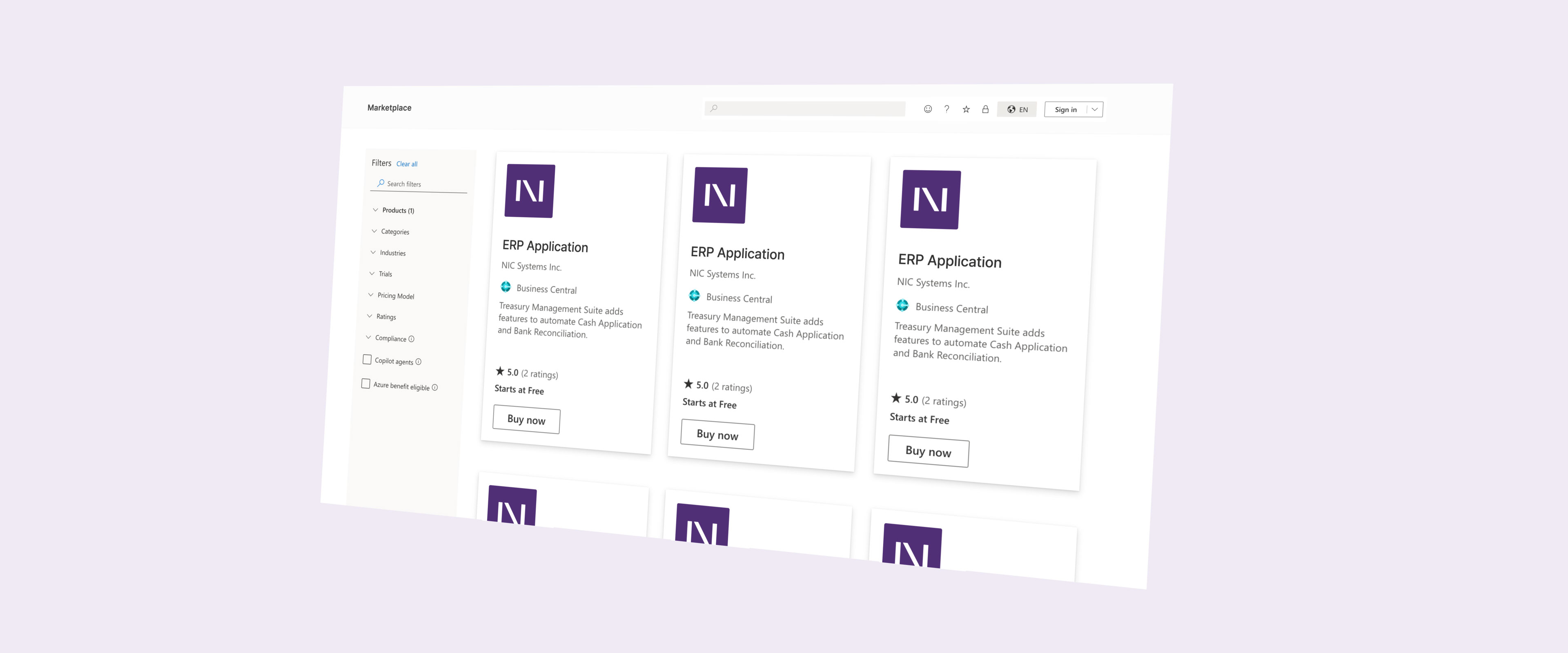
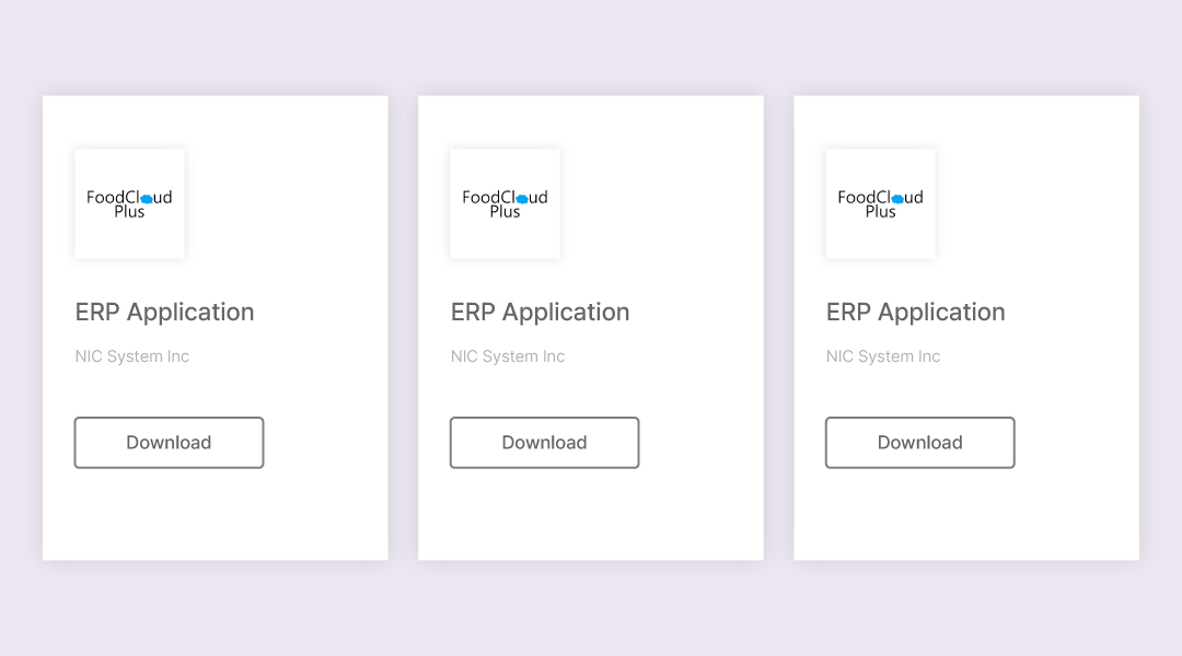
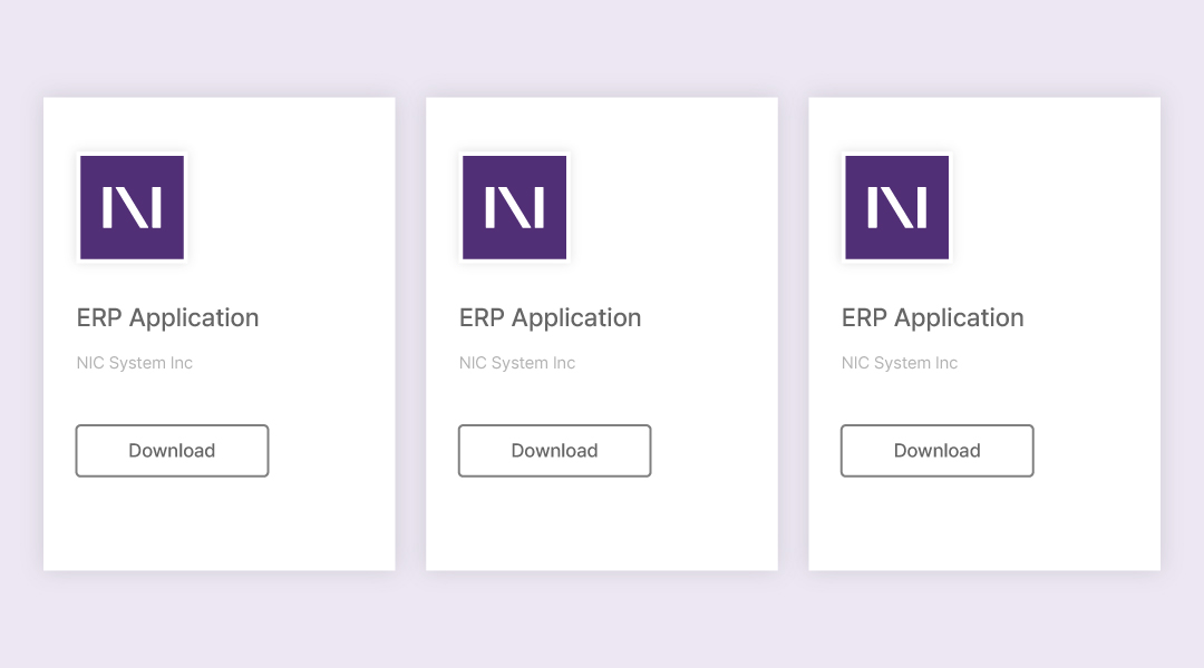
Small-scale use had been part of the brief from the beginning. NIC Systems was already appearing in Microsoft AppSource under its own name while the FoodCloudPlus logo was still being used as a placeholder.
Once the new identity launched, the FoodCloudPlus placeholder was replaced with the N-based mark. Its compact form remained clear at thumbnail size and gave NIC Systems a distinct visual presence in the listing.
Putting the Identity to Work
The identity and NIC Systems website were developed within the same three-week launch window, so the visual direction had to move into real use almost immediately.
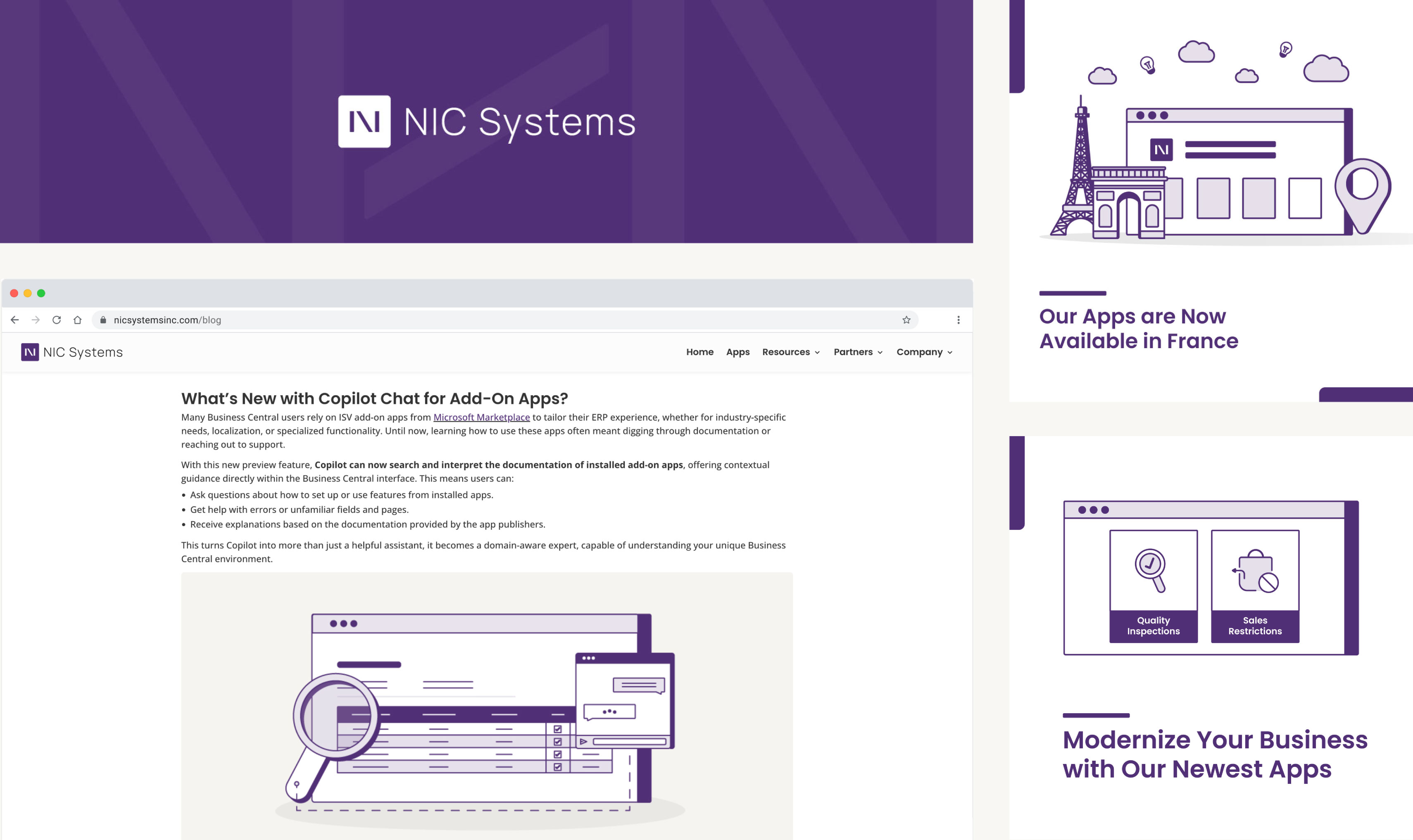
After launch, I carried the identity into the website, social graphics and supporting visuals for ongoing blog content. I worked with the content manager, who developed the written content, while I created the graphic assets needed to support and promote each piece.
The graphic assets supported content ranging from product deep-dives and practical Microsoft Business Central blog articles to app launches and announcements as NIC Systems entered new markets. I used a mix of static graphics and simple animation depending on the content and what would communicate it most effectively.
Want to see how the direction developed?
The full case study includes founder discovery, category research, design criteria, logo exploration, refinement, guidelines and rollout.
View Full Case Study