Brand Identity Development for Faiczak Food Fitness

Faiczak Food & Fitness is a small business focused on helping people of all ages and backgrounds achieve their health and wellness goals through a supportive and inclusive community.

Challenge

The owner of Faiczak Food & Fitness is set to open a gym by the end of the year and needed a brand identity aligned with their mission of “Anyone at Any age with Any goal.” Previous logo attempts felt generic and relied on overused fitness symbols. The brand needed a mark that communicated inclusivity and direction without falling into common industry cliches.

My Role

I was brought on to design the logo and style guide, establishing the core visual foundation of the brand. My focus was on creating a mark that could adapt across signage, interiors, the website, social media, and printed materials. The challenge was translating the brand’s broad audience and mission into a symbol that felt welcoming and inclusive, with a tone that balanced approachability and energy.

Outcome

The new identity gave the client their first clear and organized visual system, making it easy to keep the brand consistent across interior paint choices, signage, digital content, and printed materials. The defined palette and style guidelines also sped up decision-making during the gym buildout, since the client could apply the brand without additional design support. The client later received positive feedback from customers who said they liked the new logo and felt it was energetic and welcoming.

Discovery

The conversation that set the direction

Before sketching anything, I needed to understand what made Faiczak distinct. Not the category, not the format, but the specific thing that set this gym apart from every other fitness business in the area. That meant starting with a direct conversation with the owner rather than a written brief.
The mission was clear from the start. This was not a gym only for serious athletes or people who already knew what they were doing. It was a gym for everyone, regardless of age, experience, or background. Their core value captured it clearly.
"Anyone, any age, any goal."
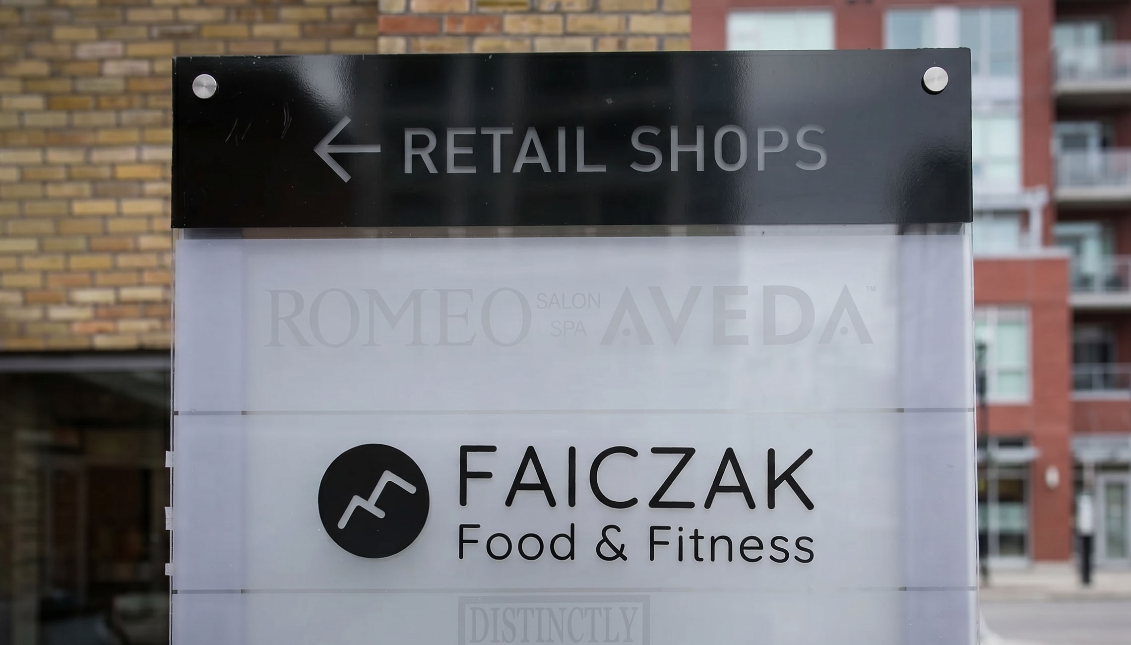
That phrase became the filter for every design decision that followed. If a direction felt exclusive, aggressive, or intimidating in any way, it was wrong for this brand. Previous attempts, including a concept combining a dumbbell and a fork, had communicated the fitness category but not the character. The owner did not need a logo that said gym. They needed one that said everyone is welcome here.
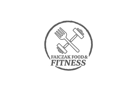
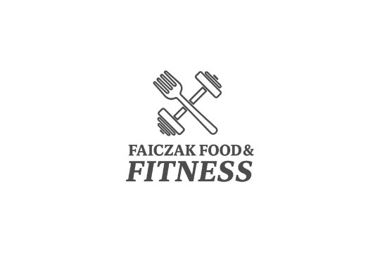
Client's Initial Logo Concepts

Discovery

Understanding the Space

Before developing any concepts I reviewed fitness brands across Ontario to understand the visual landscape. A clear pattern emerged across many of the brands I looked at. Dumbbells, flexed silhouettes, bold aggressive typography. Not every brand followed this formula, but it was consistent enough to signal a common direction in the space.
For a brand whose entire mission is built around welcoming anyone regardless of experience or background, following that same visual language would have worked against everything that made Faiczak distinct.
Commonly Overused Logo Styles

Define

Turning the insights into design criteria

How can the brand express its values without relying on the clichés common in fitness branding?
This became the filter every concept was measured against throughout the project
The risk at this stage was letting the brief stay vague. Words like "inclusive" and "welcoming" are easy to agree on but hard to design toward without making them specific. These three attributes came directly from the owner's language in that first conversation and helped define what those words actually meant in the context of this brand and community. That clarity is what made them useful as a foundation for every visual decision that followed.

Welcoming

Creating a space where everyone feels comfortable starting, no matter their experience or background.

Inclusive

Designed for everyone and every goal, without judgment or pressure.

Motivating

Uplifting, supportive energy that helps people stay consistent and feel proud of their progress.
Alongside those attributes I defined practical requirements. The logo needed to scale from a gym sign down to a social media assets, work in one-color for embroidery and apparel as well as full-color for digital, and represent both food and fitness without defaulting to literal symbols for either. The brief was clear. The challenge was finding a form that could carry all of it.

Ideation

Exploring Tone and Voice Through Moodboards

I developed three distinct directions to explore where the brand's visual identity could go based on the conversation with the client and research. Each board was designed to test a specific dimension of the brand's character rather than blend everything together into one safe middle ground.
The first tested whether personality, warmth, and energy could carry the brand without leaning on fitness conventions. The second tested a community-first visual language focused on shared progress and connection. The third explored a bolder, more intense direction to understand whether the brand had appetite for higher visual weight.
The client responded most strongly to the first direction but named something missing. The warmth and energy were right but the community dimension was absent. That response told me exactly what to carry forward and what to add. The final direction became a deliberate synthesis of the first and second boards.

Ideation

The decision that changed the mark

With the visual direction established I began developing concepts. I explored abstract forms and typographic approaches, testing how much of the brand's personality could come through the letterforms alone. Some directions referenced fitness and nutrition through subtle shapes rather than literal symbols. Others tested how much personality could come through letterforms on their own.
I presented three concepts to the client, each with a clear rationale. The F direction was the one that resonated most strongly, and from there the refinement began. That concept incorporated the letter F, representing Faiczak, Food, and Fitness, and infused it with energy and movement. A dynamic angled form felt like the right way to convey the brand's energetic and joyful personality without defaulting to obvious fitness imagery.
Then during an early review the client said something that reframed everything.
"For option two, what if the F pointed up instead of down?"
That single question changed the mark completely. I had not noticed the problem during development because I was too close to the work. A downward F carried an unintentional sense of decline. Flipping it upward introduced forward momentum, progress, optimism. The same shape read as entirely different things depending on its orientation.
Early Logo Concepts

Solution

Final Solution

The final logo brings together the two core sides of the brand, food and fitness, through two interlocking shapes that form a stylized F. The decision to use two forms working together rather than a single shape was deliberate. It reflects the brand's core belief that food and fitness are not separate disciplines but connected parts of the same journey. The mark communicates that relationship without explaining it.
The angled upward direction of the F was the direct result of the client's feedback in the review session. It reads as optimistic rather than aggressive, energetic rather than intimidating. That distinction matters for a brand trying to welcome people who might find traditional fitness culture alienating.
The circle enclosure was chosen for what it does not do. It has no hierarchy. No starting point. No direction that dominates. It looks the same from every angle. For a brand built around the idea that everyone belongs regardless of where they are starting from, that was the only logical form. A square would have implied structure and order. A triangle would have implied direction and hierarchy. The circle implies openness.

Solution

Typography

Quicksand was selected not because it looked good alongside the mark but because its rounded terminals specifically softened the overall system in a way that reinforced the approachable tone defined in the brief. A geometric sans with sharp terminals would have introduced tension with the community-first character the brand needed. A serif would have felt too formal for a gym targeting everyday people. Quicksand sits in the right position between warmth and clarity without sacrificing legibility at small sizes.

Solution

Color

Orange was not my starting point. It emerged through the moodboard review as the color the client connected with most strongly. Once it was on the table the strategic reasoning was clear. Orange carries approachability and optimism without the aggression of red or the passivity of yellow on its own. In a fitness context specifically, orange avoids the intensity associations of red while still communicating energy. It maps directly to the brand's mission of welcoming and motivating without intimidating.
Supporting neutrals were brought in deliberately to ensure the system had range. Orange as the only color would have been overwhelming across all applications. The neutrals give the system breathing room and ensure the brand works cleanly across surfaces from a gym wall to a social media post to a printed one-pager.

Final Reflection

Real Impact Comes From Designing with People, not just for them
This project allowed me to be involved from the first conversation through final delivery, which gave me a clearer view of how strategy, collaboration, and execution come together in a brand identity. Working through early exploration, defining the visual direction, and building the full system reinforced the value of staying open to feedback and using it to strengthen the work rather than protect early ideas.
The process sharpened my ability to communicate decisions, translate abstract values into visual form, and guide the client through a direction that aligns with their goals. Seeing the identity in use confirmed the importance of designing with the client’s perspective in mind and building a system that is practical for them to implement. It was a useful reminder that effective brand work is grounded in clarity, collaboration, and thoughtful problem-solving.
I'd love to hear from you!
Whether you're looking to collaborate, have a project in mind, or just want to say hi, feel free to reach out. I'm always happy to connect.